
Imagine walking into a dimly-lit caféwith warm brown walls, the aroma of roasted beans in the air, and a green mermaid logo on your cup.
Does it ring a bell?
Now, picture this: A sleek, white store with glass displays, minimalist fonts, and glowing fruit-shaped logos.
Yep, Apple.
These brands don’t just sell things, they own a vibe. And that vibe? It’s not accidental, it’s strategic visual branding at work. Brand identity isn’t just about logos; it’s about creating a memorable brand theme that sticks in your customers’ minds before they even read your name.
So why does this matter for your brand?
Hold on to that thought. Firstly,
Let’s explore how color psychology, consistent branding, and iconic visual identities (like Apple’s minimalism or Coca-Cola’s timeless red) turn companies into cultural staples—and how you can do it too.
,
How Colors Manipulate Decisions (The Hidden Science)
Color psychology in marketing isn’t pseudoscience—it’s a $400B industry secret.
- 🔴 Red (Coca-Cola, Netflix): Triggers excitement and appetite
- 🔵 Blue (Facebook, Pfizer): Builds trust and calm
- ⚫ Black (Chanel, Nike): Signals luxury and power
- 🟡 Yellow (IKEA, Snapchat): Optimism at first glance
TIPS: Choose 1-2 primary brand colors (like Starbucks’ green or UPS brown) to own an emotion in your niche.
Steal These Brand Identity Tricks from the Giants
Apple

Apple: “Less Is More”

Visual branding: White space = premium
Lesson: Minimalism can scream luxury.
Glossier
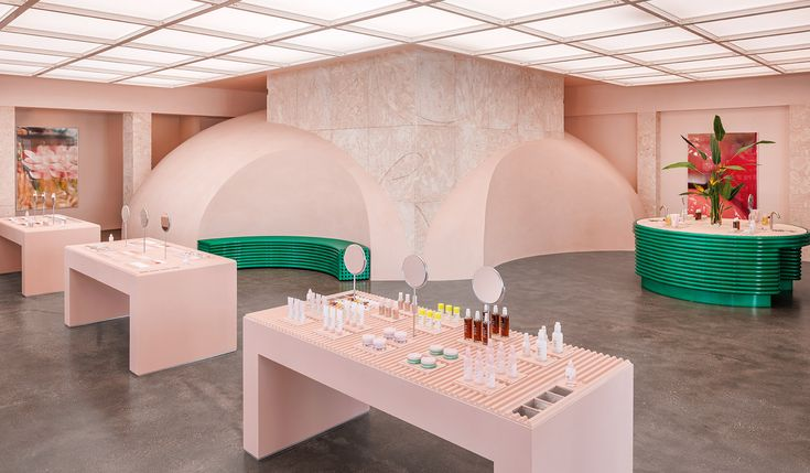
Glossier: Millennial Pink = Relatability
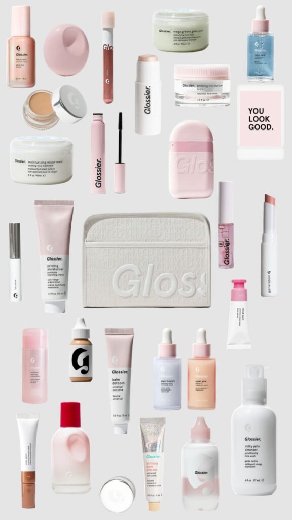
Tone: “Skincare, not makeup”
Lesson: A niche brand personality attracts rabid fans.
LEGO

LEGO: Playful = Timeless

Brand colors: Primary red/yellow/blue = kid-friendly
Lesson: Consistent branding outlasts trends.
Big Brand Examples That Nailed Their Themes
| Brand | Theme Elements | Why It Works |
|---|---|---|
| Coca-Cola | Classic red, Spencerian script, festive imagery | Evokes nostalgia and happiness5. |
| McDonald’s | Red & yellow (appetite-stimulating), playful tone | Fast, fun, and family-friendly7. |
| Nike | Bold black/white contrasts, dynamic athlete visuals | Inspires action and determination6. |
So why does this matter for your brand?
Because in a world where attention spans are shorter than a TikTok clip, your brand’s theme is your silent salesperson.
Final Thought: Your Brand Isn’t Seen—It’s Felt.
Want that "it factor" for your brand? Our team of designers and marketers specializes in crafting unforgettable visual identities—from strategic color psychology to iconic logos. Let’s make your brand instantly recognizable.